

A Study in Black and Quiet Contrast
Not every table begins with color.
Some begin with restraint.
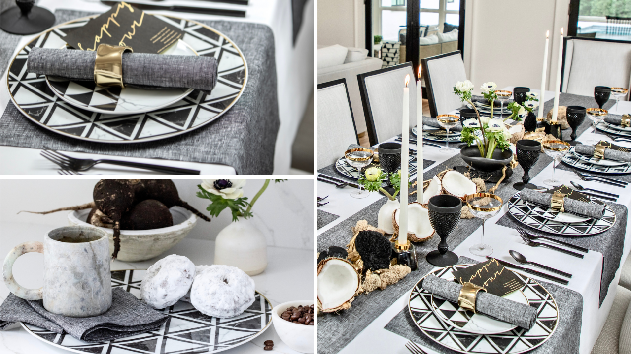
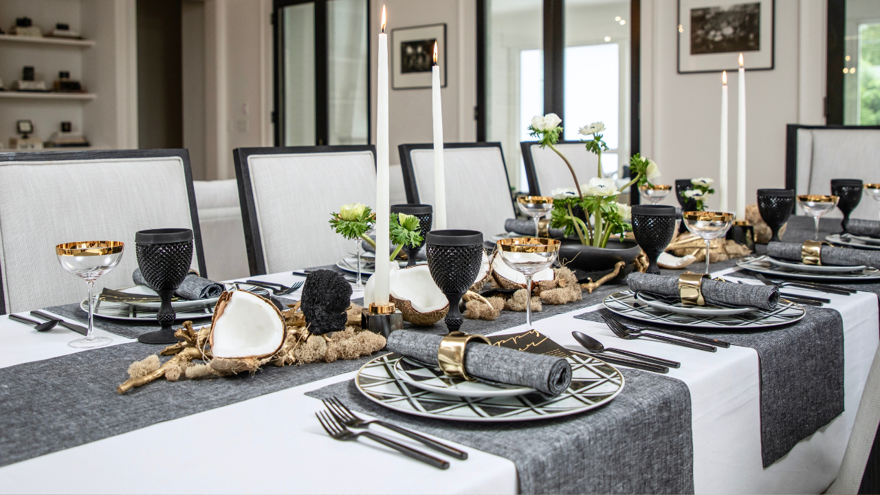
This one was built in black, softened by grey, lifted by ivory. A palette that feels structured at first glance, but slowly reveals its depth the longer you sit with it. I wasn’t looking to create drama. I was looking to create balance. The kind that feels intentional but never overwhelming.
Working with Solino Home, I leaned into their black and neutral linen textures to ground the story. This is where modern tablescape ideas begin for me. With a base that holds everything together without asking for attention. You’ll find more inspiration like this through curated styling on Table & Dine.
There’s a quiet confidence in that.
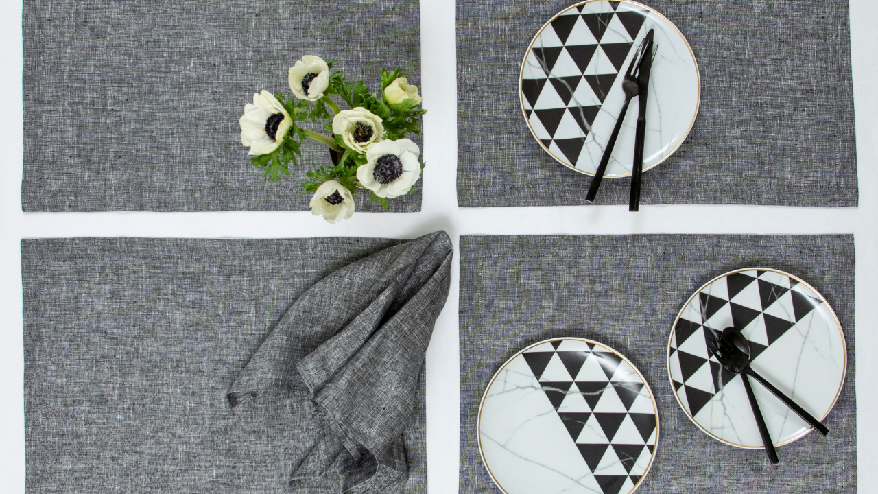
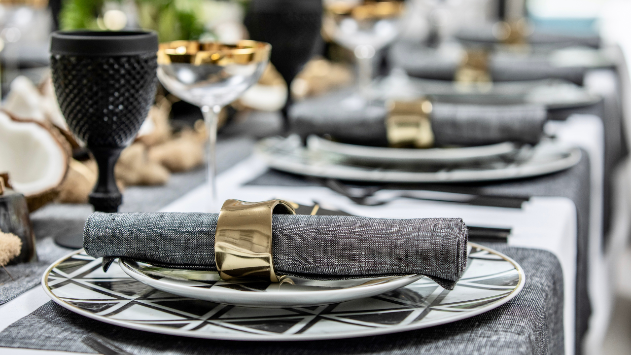
The grey linen softens the black elements. It creates that middle space where contrast doesn’t feel sharp. I think that’s what makes neutral table decor so enduring. It doesn’t rely on trend. It settles into the room.
I kept the layering minimal, but deliberate.
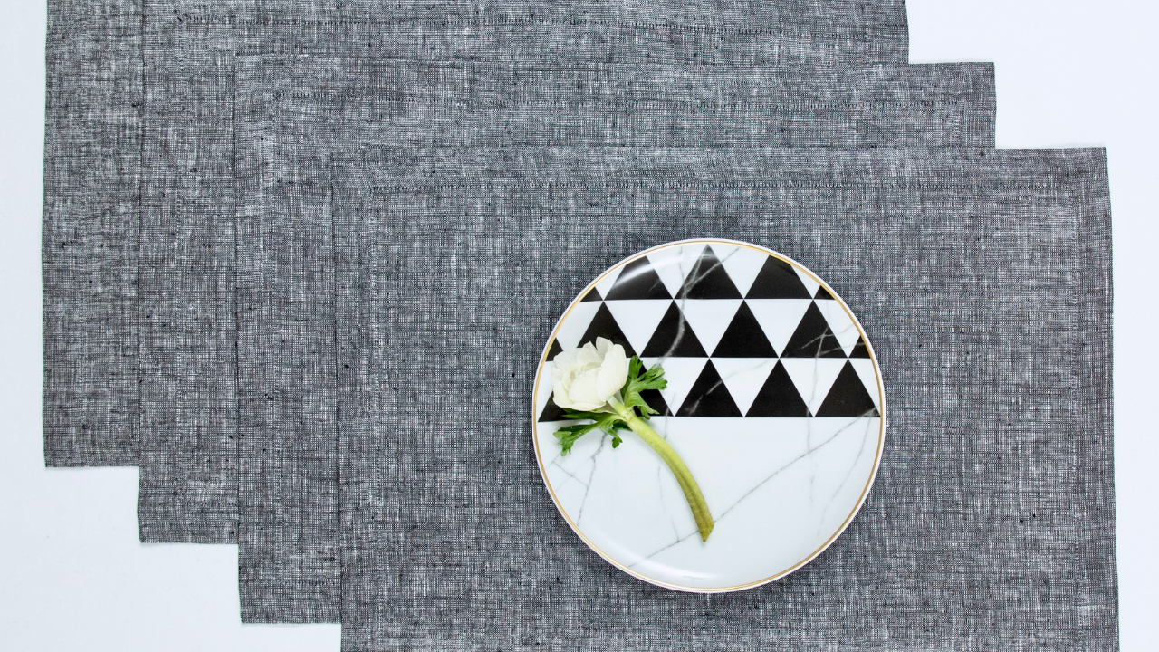
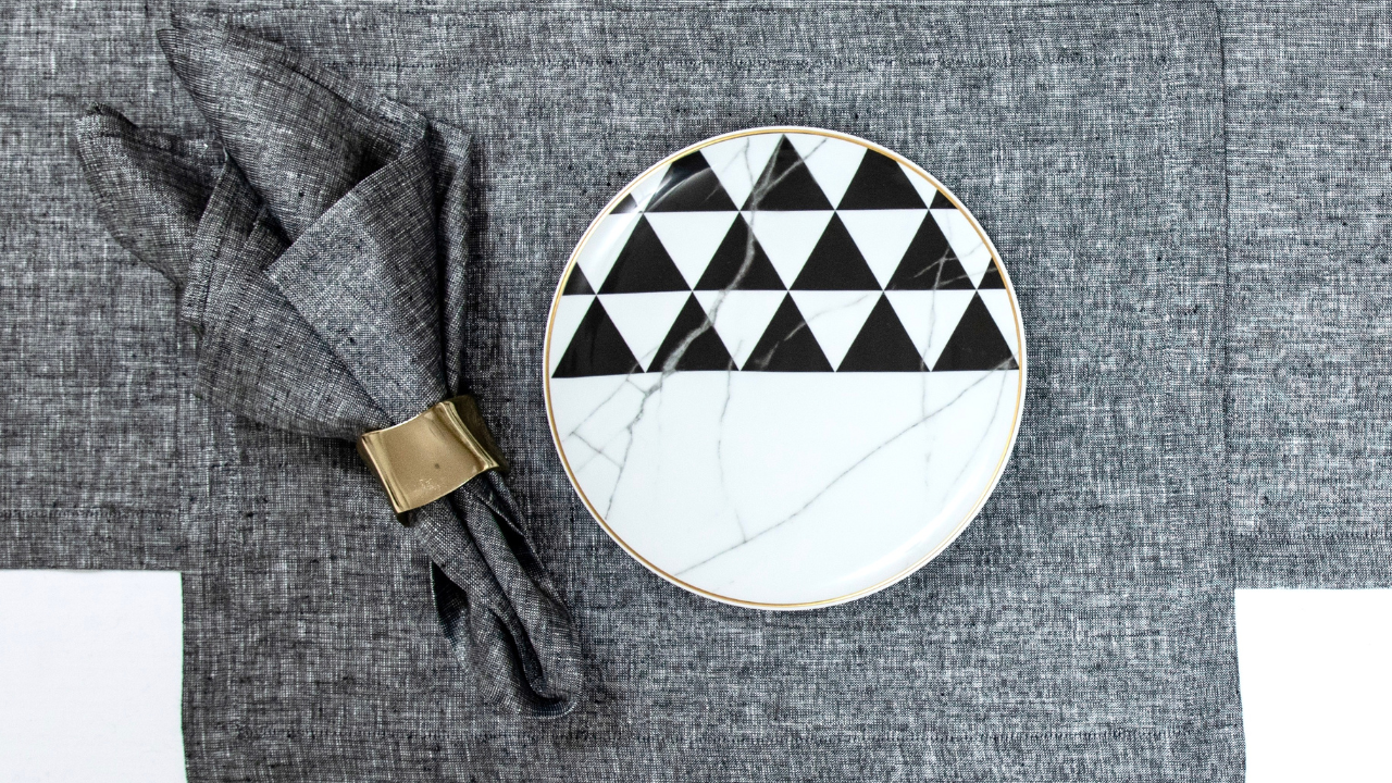
Black and white geometric dinnerware introduces structure, but it’s balanced by the organic placement around it. Plates don’t feel rigid. Napkins fall into place. That slight imperfection is what keeps the table from feeling styled in the traditional sense. Details like these pair beautifully with ideas explored in napkin styling inspiration.
Andrea held onto that feeling beautifully in the details. Nothing overworked. A napkin gathered loosely, a fold that feels natural. The hemstitch detail from Solino’s linens shows up quietly, adding refinement without interrupting the flow.
Then comes texture.
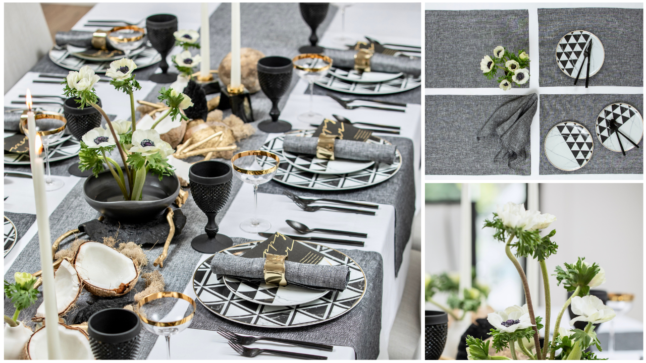
Wood tones, matte ceramics, soft linen. This is where layered table styling becomes tactile. You can almost feel the difference between each element. That’s something I always come back to when creating elevated dinner party settings. Not just how it looks, but how it would feel to sit within it. For a seasonal variation, explore more summer table inspiration.
The florals shift the tone.
Soft white blooms with touches of green. Nothing overly arranged. They don’t brighten the table dramatically. They soften it. That’s an important distinction. Especially in black and white table settings, where too much contrast can feel cold. A similar softness can be seen in warm neutral tablescapes.
Light plays differently here.
It catches on the edges. Reflects in glass. Moves across surfaces instead of filling them. This subtle interplay is often what transforms a table from styled to lived-in, something you’ll notice in soft tablescape lighting ideas.
And then, the small details.
A hint of gold. Just enough to warm the palette. I’m always careful with metallics in neutral tablescapes. They should feel like a whisper, not a statement.
If I imagine this table in use, it’s evening.
A slower, more intimate setting. Conversations that don’t need to fill silence. This is what modern entertaining ideas feel like when they lean into simplicity. Not minimal, but intentional. If you're planning your own gathering, take cues from holiday hosting ideas.
What I love about Solino Home in this setting is their ability to hold that quiet balance. Their linens don’t define the table. They support it. They allow black, grey, and ivory to exist together without competing.
There’s something about a table like this.
Understated. Grounded. A little unexpected.
Would you lean into the contrast… or soften it even more?
xx,
Deborah