

A Study in Texture and Contrast
Some tables begin with color.
This one began with shadow.
Not the heavy kind, but the quiet depth that allows every texture to reveal itself a little more slowly. Charcoal linen, matte ceramics, polished brass, delicate white blooms. Everything feels grounded, intentional, and wonderfully calm.
There is something incredibly beautiful about removing distraction and letting contrast do all the talking. Exploring this balance is a core part of my work on my blog, where I love showcasing how a thoughtful layout can shift the entire mood of a room.
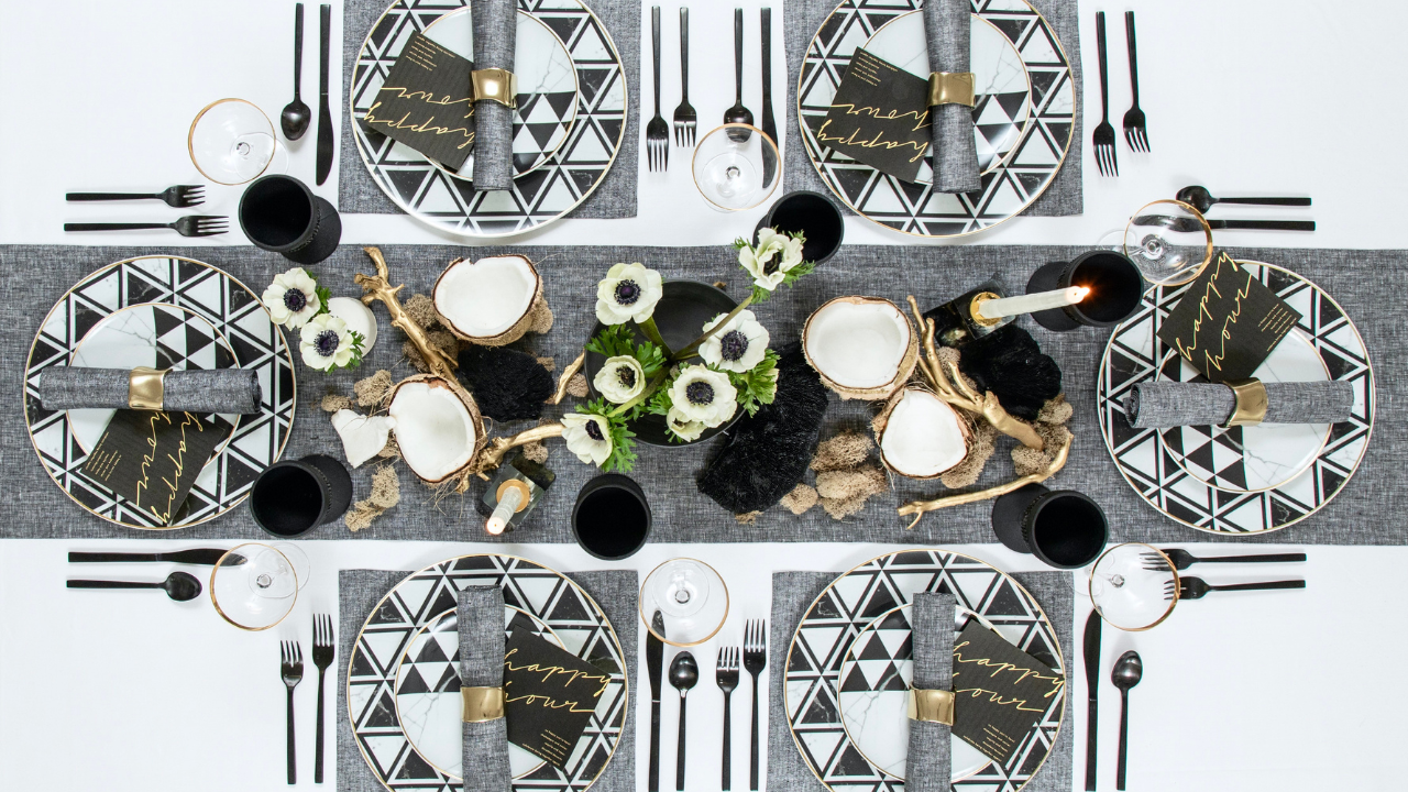
SolinoFestiveBlack-2 (Full Table Setting)
I've always believed that a table doesn't need more pieces. It needs better relationships between the pieces that are already there.
The softness of linen beside cool stoneware. Black glass reflecting afternoon light. A simple white flower interrupting an otherwise monochromatic palette. When every element has room to exist, the table begins to breathe.
It's a lesson in modern table styling, where restraint creates far more impact than abundance. This philosophy mirrors the elegant restraint found in a study in black and quiet contrast, showing that minimal colors can yield maximum depth.
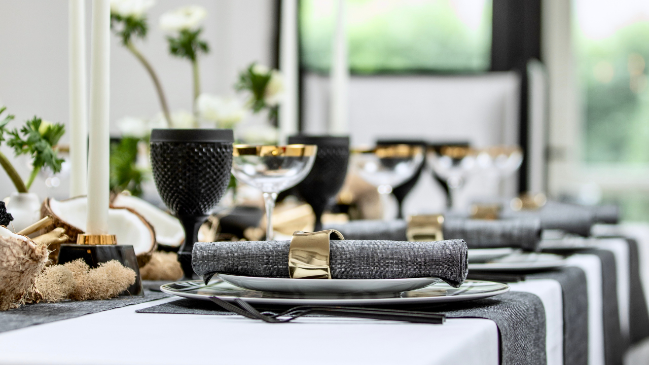
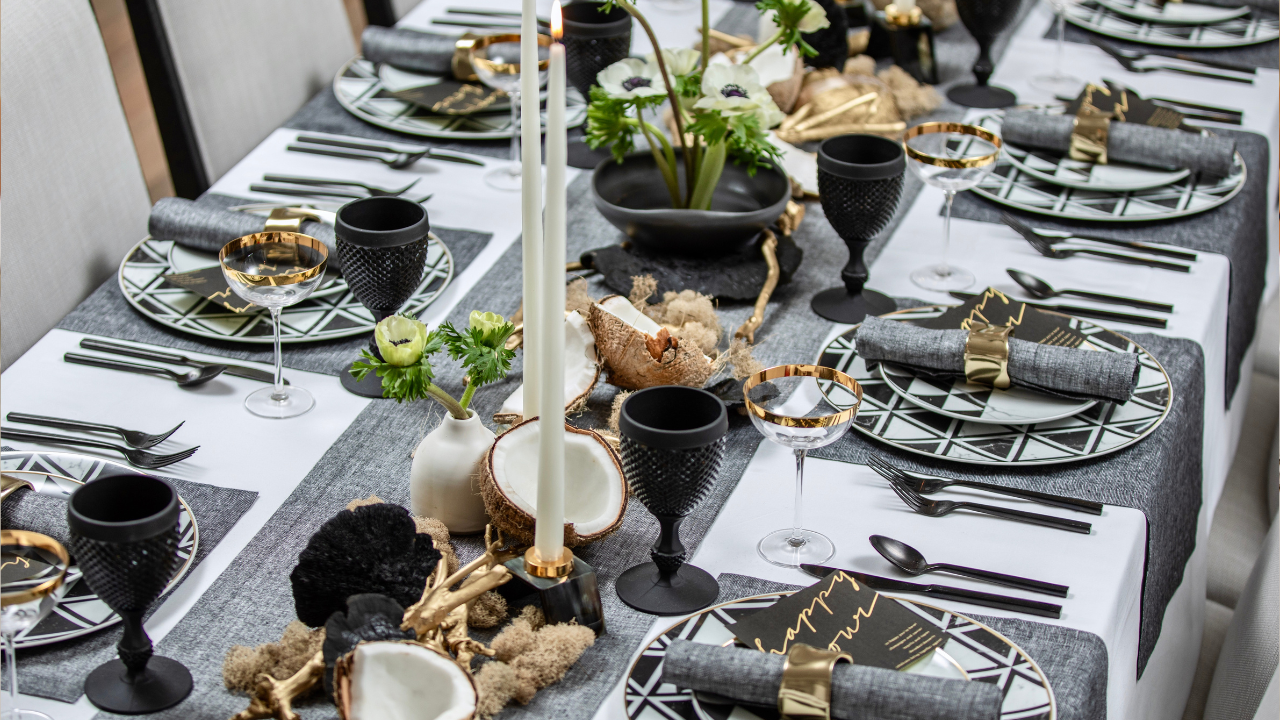
SolinoFestiveBlack-24 (Overhead Table Composition)
The charcoal linen from Solino Home became the foundation for everything else.
Rather than acting as a backdrop, it quietly anchored the entire story. The natural weave softened the graphic dinnerware, while warm brass napkin rings added just enough glow to keep the palette from feeling formal.
I love when neutral linen table settings feel layered instead of minimal. They invite you in rather than asking to be admired from across the room. It’s an approach built on comfort, similar to the inviting, relaxed luxury seen in an unscripted table with solino home.
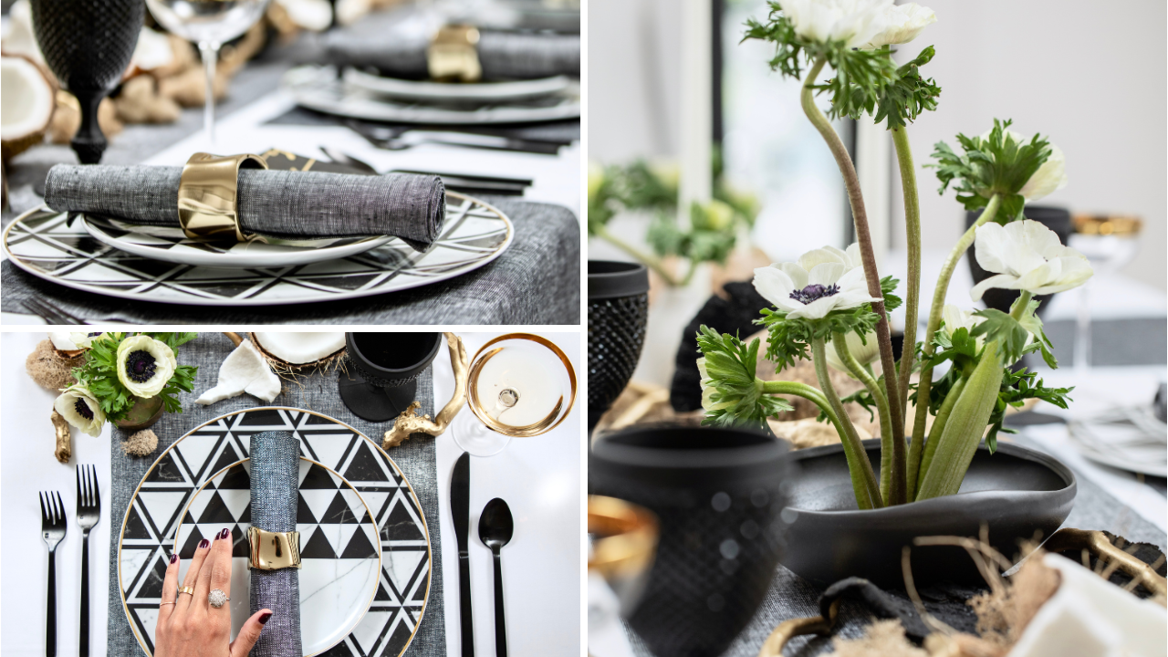
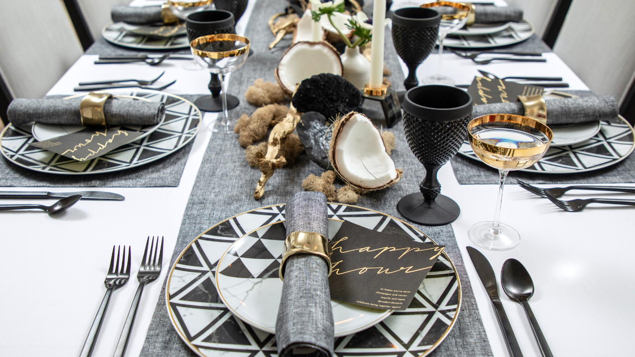
SolinoFestiveBlack-11 (Napkin with Brass Ring)
One of my favorite moments isn't the centerpiece. It's the repetition.
Plates echoing one another. Glasses catching the same light. Tiny white anemones appearing again and again across the table until they feel almost spontaneous.
Repetition creates rhythm, and rhythm creates comfort. It's one of those quiet details that transforms a simple tablescape idea into something that feels collected over time. If you want to refine this particular look, remember to put a napkin ring on it to elevate the texture of your linens instantly.
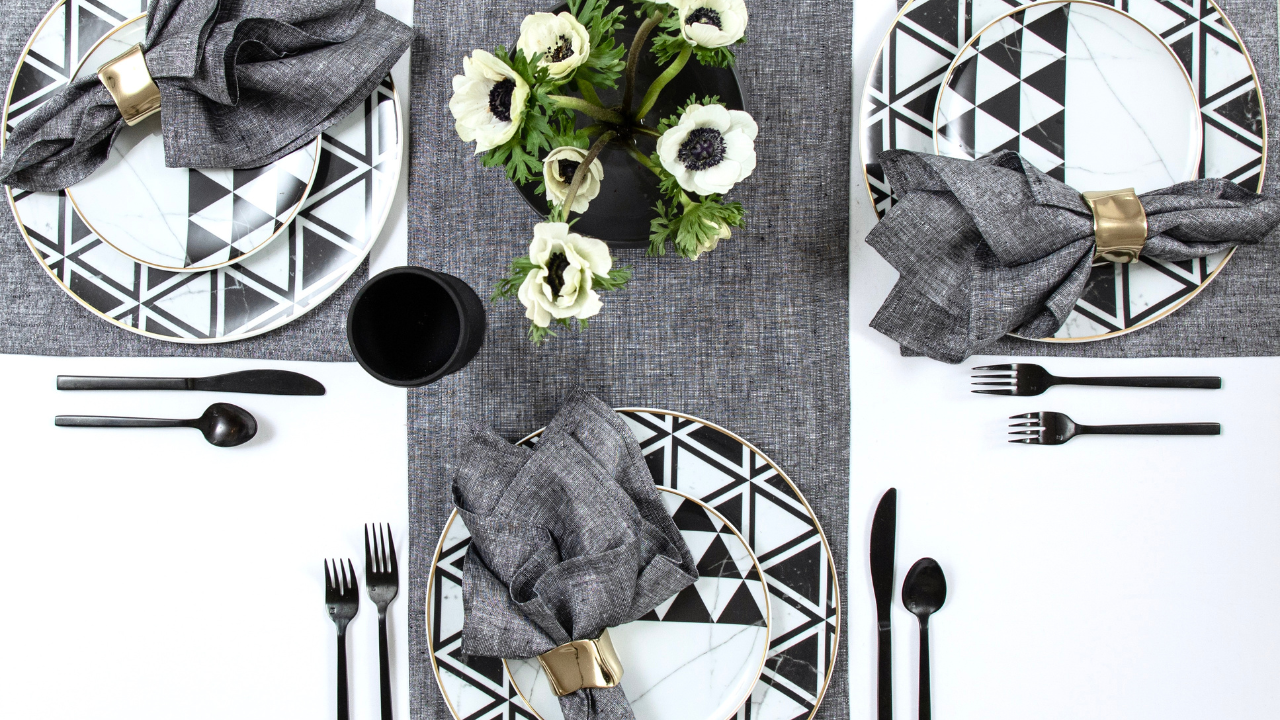
SolinoFestiveBlack-29 (Plates and Florals Overhead)
The flowers deserved their own conversation.
Nothing oversized or overly arranged. Just white anemones with dark centers, gathered loosely and allowed to move naturally through the composition. Against charcoal and black, they become almost luminous.
I've always loved that kind of contrast. It feels modern without losing softness. It is the exact kind of visual poetry we explore when highlighting curated dinnerware home decor for the modern hostess.
SolinoFestiveBlack-39 (White Anemones Close-Up)
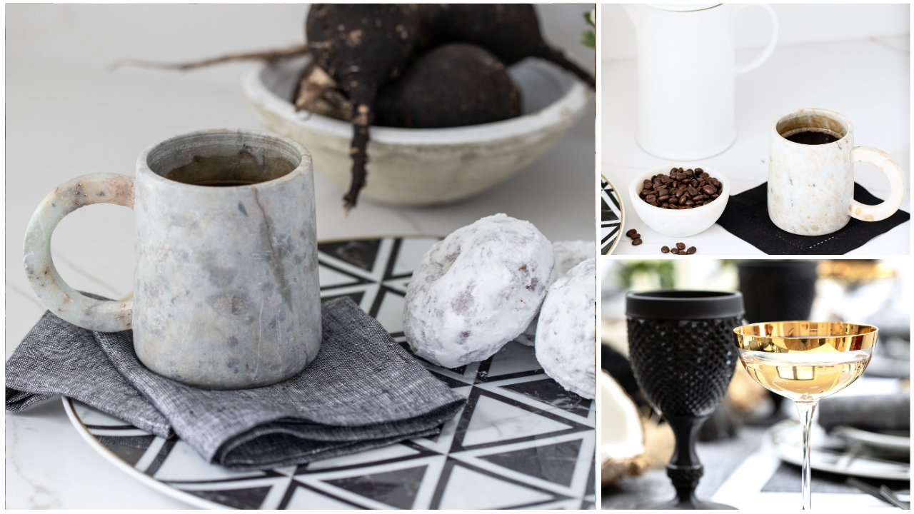
The brilliant John Bedell Photography captured the light exactly as I hoped.
It slips across matte ceramics, settles into the weave of the linen, and reflects gently from the black glassware. Nothing shines too brightly. Nothing competes. Every surface absorbs and returns the light differently, creating depth you don't immediately notice but continue discovering the longer you look.
That's the beauty of editorial tabletop styling. It rewards slowing down. This specific interaction with light reminds me of where light lands with solino home, highlighting the intricate textures of fine fabric.
SolinoFestiveBlack-35 (Glassware Detail)
There are moments when black feels dramatic. And then there are moments like this, where it feels incredibly peaceful.
The geometric dinnerware introduces structure while the organic elements soften every edge. Pears, artisan bread, simple ceramics, and natural textures prevent the palette from becoming too polished.
It's exactly the balance I look for when creating a contemporary holiday table that feels welcoming instead of formal. Rather than a stark setup, this layout leans into a warmer aesthetic, working as a study in warm neutrals with solino home by prioritizing organic elements over rigid coordination.
SolinoFestiveBlack-21 (Bread, Pears and Serving Board)
Perhaps that's why monochrome tables linger in memory.
Without bright colors competing for attention, your eye notices texture instead:
The natural, rich weave of the linen.
The smooth, matte finish of a plate.
The gentle curve of a ceramic cup.
The beautifully imperfect stem of a flower.
The experience becomes quieter, and somehow richer. It's less about decoration and more about creating an immersive atmosphere. This approach embraces a story of quiet tablescape styling, focusing entirely on tactile details.
SolinoFestiveBlack-30 (Place Setting)
If I imagine guests arriving, I don't picture perfectly folded napkins or untouched glasses.
I imagine conversation settling in slowly. Candles burning lower than expected. Someone reaching for another piece of bread. Wine poured without asking.
The table evolves naturally because it was never meant to remain perfect. That, to me, is the luxury of effortless entertaining—a scene where guests want to linger, capturing the essence of a table that lingers with solino home.
SolinoFestiveBlack-7 (Long Table Scene)
There's a tendency to think beautiful tables need more color, more flowers, more layers. Sometimes they simply need contrast.
A charcoal linen. A black plate. A white bloom. A little brass catching the light. And suddenly, everything feels complete.
To explore more design themes or view our comprehensive portfolio, visit our main hub at Table & Dine. Discover our history on the about page, view our diverse roster of clients, or shop our newer collection. You can also follow our visual journeys on Pinterest or connect with us directly on our contact page for future collaborations.
Would you stay a little longer?
xx,